


Every website starts with more than a layout — it starts with understanding the business behind it.
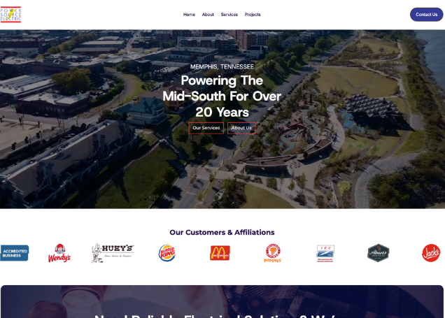
For Power Source Electric, the goal was clear: create a modern, easy-to-navigate website that builds trust, communicates services clearly, and makes it easy for customers to take the next step.
This post breaks down the thinking, structure, and design choices behind the build.
Before design begins, we focus on clarity. Power Source Electric serves both residential and commercial clients, which meant the website needed to communicate professionalism, reliability, and approachability all at once.
We looked closely at:
The goal wasn’t to over-design — it was to remove friction.

One of the most important decisions in this build was simplifying navigation. Visitors should never have to guess where to go next.
Key priorities included:
By focusing on usability first, the design naturally became cleaner and more effective.
Visually, the site needed to feel modern without losing the grounded, dependable feel of a skilled electrical company.
We leaned into:
The result is a design that supports the business, not one that distracts from it.
The finished website gives Power Source Electric a digital presence that reflects the quality of their work. It clearly communicates services, builds confidence with visitors, and provides a strong foundation for future growth.
Most importantly, it works, for the business and for the people using it.

If you’re considering a website refresh or starting from scratch, our process is always rooted in clarity, strategy, and real-world use, not just aesthetics.


.svg)

